Building Movable Type Applications
Application Development in Movable Type
Movable Type is not just a blogging platform, it is an application development environment. It’s APIs allow developers to build large scale publishing oriented applications with relative ease. Much of the traditional overhead for creating these types of application is absorbed by the Movable Type registry and by a robust data abstraction layer.
In fact many of the techniques described in this section are techniques you have already learned in Hacking Movable Type. If you have not read that guide, or are unfamiliar with the Movable Type registry and how to create a basic plugin, it is recommended that you first familiarize yourself with the basics of developing a plugin on Movable Type. If on the other hand you are ready to take your knowledge of the basics to the next level, then now is the time we bring all of your previously learned skills and knowledge of Movable Type’s interfaces together to allow you to build a Movable Type powered application.
Here are some of the topics we will cover as we build our first Movable Type application:
- What makes something a Movable Type application?
- How to create and add a new screen in the application
- How to easily add links to these newly created screens inside the application
- How to augment Movable Type’s main navigation with additional menu items
- How to create dialogs and wizards
- How to customize the look and feel of Movable Type’s administrative interface
What is a Movable Type Application
From the outside looking in, Movable Type appears to be a single and complex application. In truth, Movable Type is composed of multiple applications that act in concert with one another to produce a flexible and powerful publishing platform. Each application serves a dedicated purpose and can actually act on its own as a stand alone application, allowing for greater resource control and management - which is a technical way of saying that this allows Movable Type to scale like nobody’s business.
Here is a list of the various applications that comprise Movable Type:
- atom - handles requests via the Atom Publishing Protocol
- cms - the main Movable Type administrative interface
- comments - manages incoming comments
- feeds - Movable Type’s activity feeds
- new_search - a search backend introduced with MT 4.2
- notify - for processing blog subscriptions and notifications
- search - the legacy (pre MT 4.2) search backend
- tb - the TrackBack engine
- upgrade - for managing automated Movable Type upgrades
- wizard - the installation wizard
- xmlrpc - the XML-RPC server
Each of the applications above, along with every Movable Type application, has a dedicated .cgi file for processing requests related to the application, and each application has defined within the registry its own set of methods (or “modes”), list actions, page actions and more. Each of these concepts we will cover in greater detail later on, but for now understand that each of these aspects controls what links, widgets, and HTML Movable Type renders to the screen for the user to interact with.
Extending vs Building Applications
As a developer you have the choice of building your own dedicated application, or to extend an existing application. Building your own application offers the benefits of modularity and portability; it is recommended for those instances in which your application manifest a relatively large feature set or requires a large amount of dedicated resources (like memory, disk space, or CPU).
More often than not, however, plugins will extend an existing application. This is by far the simplest approach to take when building a plugin, as most plugins seek to augment the core application by adding a new screen, or adding elements to an existing screen. Therefore, the examples in this guide relate to extending the core “cms” application, or the main Movable Type administrative interface, commonly accessed through mt.cgi.
Application CGI
Each dedicated application utilizes its own .cgi. A separate CGI file is provided to allow the entire application to easily be transported to a separate host or cluster to expand the capacity and reliability of Movable Type. Every .cgi follows a very simple pattern, shown below:
#!/usr/bin/perl -w

use strict;
use lib $ENV{MT_HOME} ? "$ENV{MT_HOME}/lib" : 'lib';
use MT::Bootstrap App => 'MT::App::CMS';
If you were to create your own dedicated application, you would cut and paste the above sample code into your own .cgi file and replace MT::App::CMS with the name of the Perl module you create that contains all of the handlers relating to your application. The MT::Bootstrap module is what enables Movable Type to dispatch web requests to your application module at the appropriate times.
Applications in the Registry
Now, let’s take a closer look at the structure of an application as it is defined within the registry. This is important because when extending an application you need to register additional registry elements within this predefined structure. Here is a sample config.yaml file that contains a stubbed out application with an id of my_app.
name: Example Plugin for Movable Type
id: Example
description: This plugin is an example plugin for Movable Type.
version: 1.0
applications:
    my_app:
        cgi_base:
        handler:
        methods:
        page_actions:
        list_actions:
        list_filters:
        search_apis:
        menus:
        widgets:
        blog_stats_tab:
        tags:
        import_formats:
Application Registry Properties
The following are each of the application registry keys shown in the sample above explained:
- cgi_base - the file name (without the extension) of the
.cgifile for this application (e.g. “mt” formt.cgi) - handler - the package that contains all of the handlers for this application
- methods - a set of methods/modes
- page_actions - a set of page actions
- list_actions - a set of list actions
- list_filters - a set of quick filters
- search_apis -
- menus - menus and menu items registered by this app
- widgets - a set of dashboard widgets available to choose from
- blog_stats_tab - a set of tabs to be added to the stats widget on the dashboard
- tags - template tags provided by this application
- import_formats - import handlers for pulling in content from other platforms and formats
Creating a New Screen in the Application
One of the fundamentals of building a more complex Movable Type plugin, is the ability to create your own screen in the application to expose functionality beyond the scope of the core application. This is important for example to:
- create a listing screen that shows a table of data relating to your plugin.
- create an editing form to input data into the system.
An important part of building a good experience for your users, is to allow these screens you want to create to appear as a completely seamless extension of the core application. It would be awkward for example if every plugin you added to Movable Type looked and behaved slightly differently. Not only would that make it difficult for your users to learn how to use your plugin, but it also would cause Movable Type as a whole to look disjointed and poorly designed.
The good news is that the Movable Type application framework makes it easy to create additional screens that inherit the functionality that is and should be common across all screens within Movable Type. The following section will guide you through the following three steps in creating your own screens within Movable Type:
- Register a method to route requests to the mode handler
- Define a mode handler which populates the template’s context with data
- Create a template for rendering the contents of the page
Step 1. Register a Mode and Mode Handler
If you are familiar with Movable Type and its URL scheme, you may have noticed that virtually every screen within the application has a URL that contains the following query string parameter:
http://foo.com/cgi-bin/mt/mt.cgi?__mode=do_something
Each individual mode, identified by the __mode parameter, has associated with it a handler, or subroutine that is responsible for processing input from the user and rendering the results of their request to the browser. For each request Movable Type refers to the value of this __mode parameter passed in via the query string, or via form input, and looks up the corresponding handler for that mode in the registry. Movable Type then routes the request through that handler for processing invoking the necessary callbacks along the way.
To register a mode, edit your plugin’s config.yaml file and create an entry according to the example below:
name: Example Plugin for Movable Type
id: Example
description: This plugin is an example plugin for Movable Type.
version: 1.0
applications:
    cms:
        methods:
            do_something: $Example::Example::Plugin::do_something
With the mode now registered you will be able to access the screen you are about to create at the following URL:
http://www.example.com/cgi-bin/mt/mt.cgi?__mode=do_something
About Blog Context
The __mode query string parameter is a special and reserved input parameter managed by Movable Type. It knows to refer to its value for the method name to route a request to. Another reserved input parameter is blog_id. When a URL contains the blog_id parameter it automatically sets the mode’s context to that of the referenced blog (referenced by the blog’s numeric ID).
Providing the ID of blog via the blog_id parameter is what will give the app the proper blue background, and the blog specific menus for the application. It is also what instructs Movable Type to load the blog and make an instance of it available to developers through the following convenient method:
   sub foo {
    my $app = shift;
    my $blog = $app->blog();
    # do something
}
The value returned by MT::App->blog() is a complete MT::Blog object containing all of the properties and methods defined by that object.
If MT::App->blog() returns null or undefined, it is because a blog context could not be established and the developer should assume the user is operating in a system context.
Step 2. Implement a Mode Handler
Once you have have registered a mode in your config.yaml you will need to implement the handler it refers to.
Now there is a bit of a chicken and egg problem because in order for you to truly test that your handler is working you also need a template to render and display. So chances are you are going to bounce a lot between editing your handler and messing with your template until you get everything just right.
Let’s start however with the handler which ultimately is responsible for loading the template, populating its context with parameter input and data, and then returning its HTML. The HTML and/or text returned by your handler will be displayed directly to the user’s browser.
package Example::Plugin;
use strict;

# A convenience method for returning an instance of your plugin.
# The value passed to MT->component should be the directory name
# that contains your plugin's config.yaml file.
sub plugin {
    return MT->component('Example');
}

# Your mode handler
sub some_mode {
    my $app = shift;
    my $plugin = plugin();
    my $tmpl = $plugin->load_tmpl('some_template.tmpl');
    return $app->build_page( $tmpl );
}
1;
Your mode handler should return whatever HTML you want to be displayed in the user’s browser. The $app->build_page() method is made available to facilitate the process of parsing and displaying your template’s HTML to the user. If there is an error in processing your template, Movable Type will handle displaying an error to your user automatically for you.
Error Handling
Even though Movable Type will handle most error reporting for you automatically, some of those error messages can seem cryptic and indecipherable. Therefore, you may wish to check for specific error conditions yourself, and display more meaningful and useful error messages in the event that one of those error conditions exist. To do that, return the value returned by the $app->error() method, as in the example below:
sub some_mode {
    my $app = shift;
    if (<error condition>) {
        return $app->error("An really bad error just occurred. Help!");
    }
    # do your thing
}
Obtaining an instance of your plugin
To retrieve an instance of your plugin (an MT::Plugin instance technically) use the static method: MT->component. To that function you pass the name of your plugin. Now, the name of your plugin in this instance refers to the directory in which your plugin’s config.yaml can be found. For example, suppose your plugin’s config.yaml is in the following location:
/path/to/mt/plugins/MyCrazyPlugin/config.yaml
Then you would call MT->component like so:
my $plugin = MT->component('MyCrazyPlugin');
Step 3. Create your Template
The templating language used to generate the HTML of the blogs and web sites published by Movable Type is the exact same language used for rendering pages within the application. This templating language provides a rich set of template tags that abstracts developers and designers away from the core application using a customizable, but still rigid set of semantics that make Movable Type more secure and less error prone. These tags also ensure thats any new page that is created using this language will work equally well on any operating system and using almost any database.
Users familiar with Smarty, JSP, ASP, PHP or any other popular web based templating framework should feel at home using Movable Type’s templating language as it allows developers to easily interweave the programmatic display of data within HTML.
Here is the ubiquitous “Hello World” example for a Movable Type application template:
<mt:setvarblock name="page_title">This is a page title</mt:setvarblock>
<mt:include name="include/header.tmpl">
<p>Hello World!</p>
<mt:include name="include/footer.tmpl">
More powerful than your average Hello World example, this will actually produce a screen that looks and behaves like a natural extension of the core Movable Type user interface - thanks to the inclusion of the global header and footer templates.
Where to place your template
If you remember from the Movable Type Developer Guide, every Movable Type plugin should adhere to a simple directory structure. In that directory structure is a tmpl directory that contains all of the templates for your plugin or application, for example:
/path/to/mt/plugins/MyPlugin/tmpl/mt_template.tmpl
Movable Type will automatically search for templates in this directory. This directory can also contain subdirectories. Say for example you wanted to maintain a hierarchical set of templates like so:
/path/to/mt/plugins/MyPlugin/tmpl/screen_foo/main.tmpl
You could then reference that template using a relative path like so:
my $tmpl = $plugin->load_tmpl('screen_foo/main.tmpl');
Movable Type itself utilizes two includes that give every screen in Movable Type a consistent look and feel. These includes are include/header.tmpl and include/footer.tmpl. In subsequent sections we will discuss ways in which you can influence the structure and contents of your plugin’s header and footer without having to resort to hacking these template manually.
Working with Templates
Admittedly, while necessary, the Hello World example is useless. So before we go deeper into the many ways in which you can extend the Movable Type user interface, let’s orient you around working with Movable Type templates. The following section will introduce you some basic tip and tricks that will be useful in making a page look and feel like a natural extension of the core user interface.
Passing Data to a Template
The most critical component of a “template” is the ability to pass data into the template that is then dropped into pre-assigned locations. This after all is what makes something a “template” as opposed to a static HTML file.
Let’s begin by taking the above “Hello World” example and modifying who we want to say “Hello” to. First, let’s look at the template code:
<mt:setvarblock name="page_title">This is a page title</mt:setvarblock>
<mt:include name="include/header.tmpl">
<p>Hello <mt:var name="person">!</p>
<mt:include name="include/footer.tmpl">
Place this template code in the following file:
/path/to/mt/plugins/MyPlugin/tmpl/some_template.tmpl
Now we need to modify the handler to pass the parameter called “person” into the template.
sub somemode {
    my $app = shift;
    my $input = $app->{query}->param('some_formparameter');
    my $plugin = plugin();
    my $param = {};
    $param->{person} = "Byrne";
    my $tmpl = $plugin->load_tmpl('sometemplate.tmpl');
    return $app->buildpage( $tmpl, $param );
}
Looping Over Data Passed to a Template
The example above shows how to display a single variable. What if you need to display the elements contained within a list? First, let’s take a look at our Hello World handler again and see how we build a data structure that can be looped or iterated over.
sub some_mode {
    my $app = shift;
    my $input = $app->{query}->param('some\_form_parameter');
    my $plugin = plugin();
    my $param = {};

    my @people;
    push @people, { person => 'David Byrne' };
    push @people, { person => 'Harper Ford' };
    $param->{people} = \@people;

    my $tmpl = $plugin->load_tmpl('some_template.tmpl');
    return $app->build_page( $tmpl, $param );
}
As the example above shows, a loop in Movable Type is nothing more than an array of hash references, or of name/value pairs. To loop over this data structure and display its contents, use the following template code:
<mt:setvarblock name="page_title">This is a page title</mt:setvarblock>
<mt:include name="include/header.tmpl">
<mt:loop name="people">
    <p>Hello <mt:var name="person">!</p>
</mt:loop>
<mt:include name="include/footer.tmpl">
In the above example you will have noticed that we have added the <mt:loop> tag. This tag takes as input the name of an array that was passed into the template as a parameter. Within the loop you can display the value of the elements contained within the array just like you do any other variable.
Loop Meta-Variables
To assist you in customizing the display of data within your loop, Movable Type manages for you a set of variables for you that can be used inside of a <mt:loop> construct. These “meta-loop variables” are:
__first__- returns true if the current element is the first element in the list.__last__- returns true if the current element is the last element in the list.__index__- returns the current index of the list being looped over (starting at 0)__counter__- returns the number of times the current loop has been iterated over thus far (starting at 1)__odd__- returns true if the current index is an odd number (e.g. 1, 3, 5, etc.)__even__- returns true if the current index is an even number (e.g. 2, 4, 6, etc.)
For example, let’s use some of the above meta loop variables to create a properly formatted HTML list:
<mt:setvarblock name="page_title">This is a page title</mt:setvarblock>
<mt:include name="include/header.tmpl">
<mt:loop name="people">
    <mt:if name="__first__"><ul></mt:if>
    <li class="<mt:if name="__odd__">odd<mt:else>even</mt:if>">
      <mt:var name="__counter__">. Hello <mt:var name="person">!
    </li>
    <mt:if name="__last__"></ul></mt:if>
</mt:loop>
<mt:include name="include/footer.tmpl">
Including Custom Javascript and CSS in the Header
Sometimes it is necessary to inject information into the HTML head of a document, like custom javascript or CSS. Instead of customizing the header.tmpl module directly, Movable Type supports a way for you to append information into the header using the following template tag:
<mt:setvarblock name="html_head" append="1">
The key component to this tag is the use of the append argument. By setting that to true, Movable Type will ensure that if a value already exists for the variable being set it will not be clobbered. Instead Movable Type will append the new value to the old.
Here is a more complete example:
<mt:setvarblock name="page_title">This is a page title</mt:setvarblock>
<mt:setvarblock name="html_head" append="1">
<script type="text/javascript">
<!--
function do_something(f) {
    alert("Something!");
}
// -->
</script>
</mt:setvarblock>
<mt:include name="include/header.tmpl">
Creating HTML Forms
It stands to reason that at some point you will need to create an HTML form that a user will need to fill out and submit. If you look directly as the HTML source for your typical Movable Type form you may notice that it can be difficult to style and the HTML can sometimes be overly verbose. Therefore, Movable Type makes available a special tag called <mtapp:setting> which abbreviates the process of creating all of the necessary markup to make a form look like a native Movable Type component.
Here is an example template that contains a complete form:
<mt:setvarblock name="page_title">This is a page title</mt:setvarblock>
<mt:setvar name="position_actions_bottom" value="1">
<mt:include name="include/header.tmpl">
<form method="post" enctype="multipart/form-data"
    action="<mt:var name="script_url">">
<input type="hidden" name="__mode" value="a_mode" />
<mt:if name="blog_id">
<input type="hidden" name="blog_id" value="<mt:var name="blog_id">" />
</mt:if>
<input type="hidden" name="magic_token" value="<mt:var name="magic_token">" />
<mtapp:setting
    id="some_id_field"
    label="Enter text here"
    show_label="1"
    hint="Yay, text."
    show_hint="1"
    content_class="field-content-text">
    <input type="text" name="foo" size="30" />
</mtapp:setting>
<mt:setvarblock name="action_buttons">
    <button
        type="submit"
        accesskey="s"
        title="Continue (s)"
        class="primary-button">Continue</button>
</mt:setvarblock>
<mt:include name="include/actions_bar.tmpl" bar_position="bottom"
    hide_pager="1" settings_bar="1">
</form>
<mt:include name="include/footer.tmpl">
Important Note: If you are adding buttons to a screen inside of Movable Type, and that screen is not a dialog, then you also need to set the variable called position_actions_bottom to “1” as seen in the example above. This instructs Movable Type to make the buttons you define in your “action bar” visible. Note also, that this is not necessary for dialogs.
Input Parameters
- id - Each application setting tag requires a unique ‘id’ attribute. This id should not be re-used within the template.
- label - The value for the
<label>tag associated with this setting, most often a prompt of some kind for what the user should enter in the field, e.g. “First Name: “. - required - Signals if a value is required for the field when it is submitted. If no value is supplied then Movable Type will return the user to the form and display an error message directing them to supply a value. The default value for this parameter is 0.
- show_label - Toggles whether the supplied label is visible or not.
- shown - Toggles whether the entire setting or field is visible or not. This can be used in conjunction with another input parameter that controls the progressive reveal of subsidiary input elements.
- label_class - The CSS class that will be associated with the field’s label.
- content_class - The CSS class that will be associated with the field’s content.
- hint - A hint string that will be displayed in small text below the input field to prompt the user with example form input.
- show_hint - Toggles whether the hint text is visible or not.
- warning - A warning string that will be displayed to the user as a clear warning regarding the field (e.g. “changing the value of this field can break your site”).
- show_warning - Toggles whether the warning text is visible or not. The warning text is still rendered to the page in case you want to display the warning text via javascript at runtime or not.
- help_page - A URL pointing to a help document about this field.
Requests and Responses
As you get more adept at building screens in Movable Type, and as you create more advanced templates you will inevitable need to start building forms and processing their input. After all, an application won’t do very much if it has no way to respond to user input and data. The following section will introduce you to some of the common Movable Type interfaces that allow you to interact with input, and then subsequently how to modify and control output.
Handling Form Input
Input comes in a number of different forms beyond simply form data. There are cookies, HTTP headers, client information and more. The following will introduce you to the primary APIs for reading from these input sources.
Form Input
The $app->{query}->param() provides direct access to the form input parameters, either by a GET or POST request. Parameters are accessed by passing in the name of the form input parameter like so:
sub foo {
    my $app = shift;
    my $query = $app->{query};
    my $input = $query->param('first_name');
    # do something
}
Query Strings
The query string of a request refers to the data passed to a script via the URL used to access the script. It typically consists of a series of input name/value pairs like so:
http://www.somedomain.com/cgi-bin/mt/mt.cgi?__mode=method&foo=123&bar=abc
In the example above the query string refers to everything following the ?. If you require direct access to this data, you can access it via the $app->querystring() subroutine.
sub foo {
    my $app = shift;
    my $qs = $app->querystring();
    foreach my $pair (split(/&/,$qs)) {
        foreach my ($k,$v) (split(/=/,$pair)) {
            MT->log('User entered $k=$v');
        }
    }
}
Path Info
If a query string refers to everything that follows a ? in a URL, then the path info refers to everything that precedes it.
sub foo {
    my $app = shift;
    my $path = $app->pathinfo;
    MT->log('Movable Type's mt.cgi lives at $path');
}
HTTP or HTTPS?
If you require to know if Movable Type, or the form submitted was send via a secure connection (e.g. HTTPS) then the $app->is_secure() method will return true of false depending.
Remote User’s IP Address
The $app->remote_ip() method returns the IP address of the connecting client, browser or user. Keep in mind that if the user is connecting via a proxy of some kind, or often from behind a corporate firewall, the IP address may not reflect their actual IP address. In such circumstances it is possible for a number of users to access the application to exhibit the same IP address. To account for this, please consult the TODO configuration directive.
Document Root
The document root, or “doc root” as it is commonly referred to, is the location on the file system that your web server serves content from. To access the document root for your web server use the $app->document_root() method.
Raw Request Content
If you need direct access to the data submitted via a form post, then the $app->request_content() method will return all of the content following the HTTP headers of the request - verbatim.
Request Method
The $app->request_method() returns either GET, PUT, POST or DELETE referring to the HTTP method used to submit form input.
Control Flow in a Template
When a mode handler completes its operation it can return either a block of HTML that will be returned directly to the browser, or it can return a number of values to control the flow of the user to another page in the application. For example, a handler can signal to Movable Type that there was an error, or that a redirect to another URL is needed. Here is a list of the various return functions:
$app->add_return_arg( %hash )
This method is used prior to returning from your mode handler. It is used to append querystring parameters to the URL of the page the user is ultimately redirected to. A common usage for this method is to append a querystring parameter that can be used to surface a status message of some kind on the destination page. This is how, for example, Movable Type is able to add the “You entry has been saved” informational message to the screen after saving and publishing a blog post.
Let’s take a look at the following code sample.
sub handler {
    my $app = shift;
    # do something
    $app->add_return_arg( object_saved => 1 );
    return $app->call_return;
}
Let’s say that the user invoked this mode from the following URL:
http://somedomain.com/cgi-bin/mt/mt.cgi?__mode=my_handler
Then the code above will return the user to the same URL, but with the following URL:
http://somedomain.com/cgi-bin/mt/mt.cgi?__mode=my_handler&object_saved=1
$app->call_return()
Invoking call_return() will return the user to the page from which they originated. This method is commonly invoked in conjunction with the add_return_arg() method as discussed above.
$app->error($str)
The error method instructs Movable Type to return an application error with a message designated by the developer. The error message will also be logged in Movable Type’s Activity Log as an error.
sub handler {
    my $app = shift;
    # do something
    return $app->error("What are you doing Dave?");
}
$app->errtrans($str)
The errortrans method does the same as $app->error() except that it routes the error message through Movable Type’s built in translation system in an attempt to return the error message in the appropriate language.
sub handler {
    my $app = shift;
    # do something
    return $app->errortrans("What are you doing Dave?");
}
$app->logout()
This method can be invoked to forcibly logout the current user from the blog or application.
$app->mode($mode)
This sets the current mode of the application. It can be used to control which application mode is used to render the page in response to the current request. The following code sample for example will process the request, and then invoke the mode registered with name of “a_different_mode”.
sub handler {
    my $app = shift;
    # do something
    return $app->mode( 'a_different_mode' );
}
$app->redirect($url, %options)
The redirect method initiates an HTTP redirect by setting the HTTP “Location” header for the response. The value can be set at any time during the course of the request.
sub handler {
    my $app = shift;
    # do something
    $app->redirect('http://www.somedomain.com/');
    # do something else
    return;
}
Redirects made in this manner are sent in conjunction with an HTTP status code of 302.
Allowable options are:
UseMeta- If set to true then the request will be redirected by issuing a text/html entity body that contains a “meta redirect” tag. This option can be used to work around clients that won’t accept cookies as part of a 302 Redirect response.
$app->trace($msg)
This method is used for debugging. Under normal operating conditions this method will do nothing. When DebugMode is turned on however, this method will result in the message provided to be displayed at the bottom of the screen in a special debugging section of the footer.
Working with HTTP Headers
The following methods allow the plugin developer to modify the HTTP headers that are returned with a request.
$app->get_header($str)
This method returns the value of the HTTP header passed in as input.
$app->response_code($int)
This method sets the HTTP status code that will be sent with the response. Most of the time this is done for you by Movable Type, but from time to time, you may wish to override the default. Here are the most common response codes:
- “200” - success
- “301” - page has moved (a.k.a. “redirect”)
- “404” - page not found
- “500” - yikes, an error occurred
See also: List of HTTP codes
$app->response_content_type($str)
This methods sets the content type of the response returned by Movable Type. In almost all circumstances this is “text/html,” but developers from time to time may wish to override this default setting.
$app->response_message($str)
This method sets the message that is returned in conjunction with any request that is not a success (or an HTTP status code of 200). This message is displayed in most browsers and can be used to provide more useful feedback to the user in the event of an error.
$app->set_header($name,$value)
Adds the specified HTTP header to the list of headers that will be returned with the response.
$app->set_no_cache($bool)
When set to true, signals to the browser that the results should not be cached locally by the browser. This forces the browser to re-download and re-render the page.
Setting and Retrieving Cookies
The following methods can be used to set and get cookies for the current user.
$app->bake_cookie(%args)
This method sets a cookie to be stored by the current user’s browser.
It receives an associative array, or hash, as input which can contain any valid parameters to the “new” methods of the CGI::Cookie perl module including:
- “-name”
- “-value”
- “-path”
- “-secure”
- “-expires”
If you do not include the “-path” parameter in %arg, it will be set automatically to “$app->path”.
This method will automatically assign a “secure” flag for the cookie if it the current HTTP request is using the https protocol. To forcibly disable the secure flag, provide a “-secure” argument with a value of 0.
For example, to set a cookie with a name of “foo” and a value of “bar” that expires in 3 months, use the following:
sub handler {
    my $app = shift;
    # do something
    $app->base_cookie( -name => 'foo', -value => 'bar', -expires => '+3M' );
}
$app->cookies()
To access all the cookies associated with a request, the $app->cookies() method will return a hash containing every cookie. The keys of the hash correspond to the cookie names, and their corresponding values are a complete CGI::Cookie object giving you access to the expiration date, cookie path, cookie domain and other cookie properties.
$app->cookie_val
For expediency, if you want to simply retrieve the value of a cookie transmitted from the client, use the $app->cookie_val($name) method. Pass in the cookie name as an argument and receive its value.
See Also
Magic Tokens
“Magic Tokens” are used by Movable Type as a security precaution.
One common technique used by hackers is called a “replay attack” where they intercept a request from a session and are then able to resend it after making slight modifications to it. Magic tokens, which contain an encrypted timestamp, can be transmitted with a request and then subsequently verified to make these types of attacks more difficult.
Developers building plugins for Movable Type are strongly encouraged to generate and then validate a token with every form submission. The following are the methods you will need to familiarize yourself with:
$app->make_magic_token
Creates a new “magic token” string that can be embedded into a form as an input parameter. It should be used in conjunction with validate_magic to ensure that the
$app->validate_magic()
Checks for a magic_token HTTP parameter and validates it for the current author. If it is invalid, an error message is assigned to the application and a false result is returned. If it is valid, it returns
return unless $app->validate_magic;
To populate a form with a valid magic token, place the token value in a hidden form field:
<input type="hidden" name="magic_token" value="<mt:var name=MAGIC_TOKEN>" />
If you’re protecting a hyperlink, add the token to the query parameters for that link.
Building Menus
Movable Type allows you to add menus and menu items to the main navigation of the main Movable Type application. This is a great way for you to provide convenient links to your users and an intuitive way in which to access your plugin.
Creating a New Menu
The following sample code will add a new menu labeled “My Menu” with a single menu item called “Upload Video.”
name: Example Plugin for Movable Type
id: Example
description: This plugin is an example plugin for Movable Type.
version: 1.0
applications:
    cms:
        menus:
            mymenu:
                label: 'My Menu'
                order: 600
            mymenu:video:
                label: 'Upload Video'
                mode: 'video_upload'
                order: 301
                args:
                    '_type': "blog"
                permission: 'manage_assets,publish_post'
                view: blog
Adding Items to an Existing Menu
The following sample code will add a menu item labeled “My Objects” to Movable Type’s “Manage” menu:
name: Example Plugin for Movable Type
id: Example
description: This plugin is an example plugin for Movable Type.
version: 1.0
applications:
    cms:
        menus:
            manage:myobjects:
                label: 'My Objects'
                mode: 'list_myobjects'
                order: 301
                args:
                    '_type': "blog"
                permission: 'manage_assets,publish_post'
                view: blog
Here is a list of the menu IDs that Movable Type ships with that you are free to extend:
- create
- manage
- design
- prefs
- tools
Registry Properties
label - the name of the menu item as it will appear in the menu
mode - the app mode that will be invoked when you click the link. Note: this will require you to define and register an app mode with the same name as the value of this property.
dialog - as an alternative to
modeone can specifydialogwhich will spawn a dialog window that invokes the mode with the name assigned to thedialogpropertyorder - the order or placement as it will appear in the list.
permission - a comma delimited list of required permissions in order for this menu item to be active for the current user
args - a list of key/value pairs of query string parameters that will be appended to the link associated with this menu item
view - valid values are “blog” or “system” and they determine whether the menu item should appear in the blog context menu set or the “System Overview” menu set.
Dialogs
Movable Type provides a simple way to spawn a javascript based modal dialog with minimal coding. All you need to do is the templating the governs the contents of the dialog. The following section will show you how to:
- create and style a dialog
- how to spawn the dialog in response to a variety of events
Creating a Dialog
The trick to understanding how dialogs work in Movable Type is in the fact that a dialog is just another web page or mode handled by Movable Type. Like any screen in Movable Type, a dialog is powered by two components: a template that controls the presentation of the dialog, and a handler that controls the data and application logic that makes the dialog perform an action.
Register Your Dialog
Since dialogs are nothing more than a specialized screen in Movable Type, the steps in creating one begin, as always, with registering your mode handler within your config.yaml like so:
name: Example Plugin for Movable Type
id: Example
description: This plugin is an example plugin for Movable Type.
version: 1.0
applications:
    cms:
        methods:
            my_dialog: $Example::Example::Plugin::my_dialog
Your handler then simply loads the template and renders it to the screen. In a moment, you will see a sample template which you can customize to suit your needs. Here is the handler to render your dialog:
sub my_dialog {
    my $app = shift;
    my $plugin = MT->component('Example');
    my $tmpl = $plugin->load_tmpl('dialog.tmpl');
    return $app->build_page( $tmpl );
}
The Dialog Template
Two template modules are made available to dialogs to make styling very simple. The dialog/header.tmpl and dialog/footer.tmpl modules provides the basic Movable Type style chrome for a dialog.
Set the title of the javascript using the page_title variable. Then in between the header.tmpl and footer.tmpl includes, enter any HTML you wish.
Design Consideration: modal dialogs are a fixed width and height and the presence of scroll bars in a dialog is non-optimal. If you require more screen real estate then is alloted by Movable Type, consider turn your modal dialog into a multi-step dialog.
Adding Javascript or CSS to a Dialog
Some dialogs may need additional Javascript or CSS in order to provide functionality that may not be defined by default in the standard dialog header and footer templates. You can however, easily insert your own by appending content to the html_head variable found in the header template as the following sample demonstrates:
<mt:setvarblock name="html_head" append="1">
  <script type="text/javascript">
    <!-- insert javascript here -->
  </script>
  <style>
    <!-- insert CSS here -->
  </style>
</mt:setvarblock>
<mt:include name="dialog/header.tmpl">
<!-- insert your page content here -->
<mt:include name="dialog/footer.tmpl">
Dialog Buttons
If your dialog contains a form, which is often the case, button may be needed in order for the user to advance to the next step in the wizard, or to submit and close the dialog. To insert buttons that are aligned and styled properly at the bottom of the dialog window you will need to encapsulate your buttons with the proper HTML. The following is an excerpt from a template that shows exactly how to style buttons in Movable Type:
<mt:include name="dialog/header.tmpl">
<form ....>
    <!-- insert form fields here -->
    <div class="actions-bar">
        <div class="actions-bar-inner pkg actions">
            <button
                type="button"
                accesskey="s"
                class="primary-button close">Confirm</button>
            <button
                onclick="closeDialog(); return false"
                type="submit"
                class="cancel"
                accesskey="x"
                title="Cancel (x)">Cancel</button>
        </div>
    </div>
</form>
<mt:include name="dialog/footer.tmpl">
Spawning a Dialog
Now that you have successfully created a dialog, you need a way to open it from within the application. There are primarily two different ways to open a dialog:
- manually constructing a link via HTML and Javascript
- in response to a user clicking on a menu item in Movable Type’s main navigation
Opening a Dialog from a Link
To cause a link to open a dialog over the content or page the user is currently viewing, a little javascript is required. The javascript function that needs to be called is openDialog which is loaded for you automatically on every page inside the Movable Type application. The openDialog javascript function takes three parameters:
- source - this parameter is present for backwards compatibility purposes. It is permissible to pass the value
nullto this input parameter - mode name - the name of the mode registered with Movable Type that will be invoked. This is the mode name for your dialog as registered within your
config.yamlfile. - query string - any additional parameters you want to pass to the dialog
The following HTML demonstrates how to compose the link and javascript function call:
<a href="javascript:void(0)"
    onclick="openDialog(null,'<mode name>','<query string>');return false;">
  Link Text
</a>
The URL the dialog will contain is composed by appending the javascript variable ScriptURI, the text ?__mode=, the input parameter mode name, and the text found in the input parameter query string.
Opening a Dialog from the Navigation Menu
Dialogs can be spawned directly from a menu item in the navigation menu, as in the “Upload File” menu item in the Create menu. To spawn a dialog, one would register their menu item using the dialog property as illustrated below:
name: Example Plugin for Movable Type
id: Example
description: This plugin is an example plugin for Movable Type.
version: 1.0
applications:
    cms:
        menus:
            create:launch_dialog:
                label: 'Launch a Dialog'
                dialog: 'launch'
                order: 302
                view: blog
Shortcuts, Page and List Actions
Now that you have successfully created a page inside of Movable Type, you need to make it more accessible and easier to find for your users. There are a number of ways to do this, the most prominent one being adding a link to the main menu. However, sometimes the feature you are building is not big enough to warrant a place in the main navigation, or perhaps the feature is only relevant within certain contexts.
To accommodate features of this scope or nature, Movable Type reserves space on virtually every screen for plugins to inject links into the sidebar or elsewhere. This makes it possible to extend the core user interface without having to hack HTML or modify the core templates. It has allows you to add this links in a backwards and forwards compatible manner.
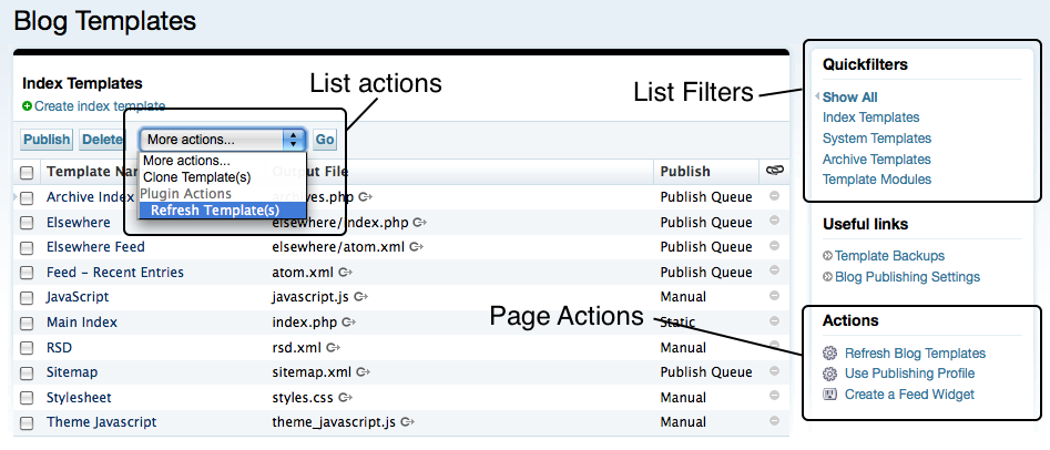
In this section we will learn more about the three primary ways to add links and actions to a page:
Page Actions - How to add a link to the sidebar of any page in the application.
List Actions - How to add an option to the pull down menu associated with any listing table to allow a function to performed against all currently selected rows.
List Filters - How to add “Quick Filters” to any listing table to easily filter a table to against a custom set of constraints.
Page Actions
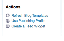
Page actions are links that can be registered by plugins to appear in the sidebar of virtually any page in Movable Type. Page actions provide an easy way for plugins to augment the HTML of the page to surface the ability for users to perform some action in relation to the content on the screen.
Let’s take a look at the following example and then walk through it line-by-line so that we can see what is going on.
 1 name: Example Plugin for Movable Type
 2 id: Example
 3 description: This plugin is an example plugin for Movable Type.
 4 version: 1.0
 5 page_actions:
 6    comment:
 7        promote_indiv:
 8            label: Promote to Entry
 9            order: 101
10            code:  $Example::Example::Plugin::comment_page_action
11            permission: edit_all_posts
On line 6 you see the phrase “comment” which refers to the page you wish to target. A list of pages you can target page actions for has been provided below.
On line 7 you see the unique ID or key the developer has assigned to the page action. It is not used directly by Movable Type.
Lines 8-11 contain all of the registry properties for the individual page action with an id of promote_indiv. For a complete list of allowable registry properties, see the list below.
Registry Properties
- label - a string representing the name of the link that will be displayed on the targeted page.
- order - a number that controls the sort order, or in which position your link will appear relative to other page actions.
- condition - a reference to a subroutine that will return 1 if the corresponding page action should appear, and 0 otherwise.
- permission - a comma delimited list of permissions that the current user must possess in order to see and click on the link (see “Binding Permissions to Modes or Dialogs” for a list of the permissions you can refer to).
In addition to the above properties, you will need specify how Movable Type will handle a user clicking on a page action. There are three possibilities: 1) link directly to a page, 2) spawn a dialog or 3) perform a form post. Each of these corresponds to the following registry properties, of which you can only specify one:
- mode - a string representing the mode (the value of the
__modequerystring parameter) Movable Type will construct a link to. - dialog - like the “mode” property, the value of this property is also the name of a mode, but instead of linking directly to the screen referred to by “mode,” Movable Type will spawn a modal dialog containing the contents of “mode”.
- code - a reference to a handler in your
Plugin.pmfile that will process a form post containing information about the page action being clicked on (see example below).
Page Action Handler
If you register a subroutine to process your results by using the code registry property, then you will need to implement a handler to process the request that is triggered when the user clicks on the link. The following is an example page action handler.
sub comment_page_action {
    my ($app) = @_;
    $app->validate_magic or return;
    require MT::Comment;
    my $comm_id = $app->param('id');
    my $comm = MT::Comment->load($comm_id) or next;
    # Do something
    $app->redirect(
            $app->uri(
                mode => 'view',
                args   => {
                    '_type' => 'entry',
                    blog_id => $app->blog->id,
                    id      => $comment->entry->id,
                }
            )
    );
}
A couple notes about the code sample above:
When Movable Type creates the page action link for you, it will automatically include additional information in the URL to signal to your handler what the request may be in regards to. For example, when adding a page action to the “Edit Comment” screen, the page action link will include the ID of the comment currently being edited.
The
$app->validate_magicshould be called by any page action handler and is there for security purposes. Removing it will not impact the functionality of your handler, but it is recommended nonetheless.
Pages You Can Target
The following is a list of the pages that can be targeted with page actions. Each of the following pages refers to the editing screen for the object with the corresponding name (e.g. asset refers to the edit asset screen):
assetauthorblogcategorycommentcommenterentryfolderpingtemplate
As you might expect by glancing at the list below, each of the following refers to the listing screens for the object type with the corresponding name (e.g. list_author is for the author listing screen/table):
list_assetlist_authorlist_bloglist_categorylist_commentlist_entrylist_memberlist_notificationlist_pinglist_taglist_template
And then the rest:
view_log- the activity log screen for a blog and for the system
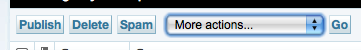
List Actions
Each and every listing screen in Movable Type can have associated with it a list of “list actions.” List actions can be found in a pull down menu typically located in the table header of any tabular list in Movable Type. If no pull down menu appears it is because no list actions have been registered for that list.
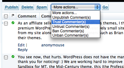
List actions can be used to perform an operation against multiple records or objects at a time. A user will select some items in the table, then select the list or plugin action from the pull down menu, and click the “Go” button. Movable Type will then invoke the designated handler for the list action with an array of IDs corresponding to the items currently selected.
To add a list action you will need to first know which list or table you want to target. Then consult the following example config.yaml to see what changes you will need to make to your own.
 1 name: Example Plugin for Movable Type
 2 id: Example
 3 description: This plugin is an example plugin for Movable Type.
 4 version: 1.0
 5 list_actions:
 6     comment:
 7         promote:
 8             label: Promote to Entry
 9             order: 200
10             code:  $Example::Example::Plugin::itemset_handler
11             permission: edit_all_posts
12             input: 1
13             input_label: "Please select some data below
On line 6 you see the phrase “comment” which refers to the listing screen you wish to target. A list of listing screens or tables you can target list actions for has been provided below.
On line 7 you see the unique ID or key the developer has assigned to the list action. It is not used directly by Movable Type.
Lines 8-13 contain all of the registry properties for the individual page action with an id of promote_indiv. For a complete list of allowable registry properties, see the list below.
Registry Properties
- label - a string representing the name of the item that will be appear as a list item in the list action pull down menu.
- order - a number that controls the sort order, or in which position your link will appear relative to other page actions.
- condition - a reference to a subroutine that will return 1 if the corresponding page action should appear, and 0 otherwise.
- permission - a comma delimited list of permissions that the current user must possess in order to see and click on the link (see “Binding Permissions to Modes or Dialogs” for a list of the permissions you can refer to).
- input - A boolean value that controls whether Movable Type will prompt the user for input just prior to continuing with the operation. Input will be provided by the user through a simple javascript prompt dialog, the label for which is specified via the “input_label” property.
- input_label - The text label to use for the prompt for user input. The value contained by this property is only used when the
inputproperty is set to true.
In addition to the above properties, you will need specify how Movable Type will handle a user selecting a list action and clicking the “Go” button. There are three possibilities: 1) send the user directly to a page, 2) spawn a dialog or 3) perform a form post to a handler. Each of these corresponds to the following registry properties, of which you can only specify one:
- mode - a string representing the mode (the value of the
__modequerystring parameter) Movable Type will construct a link to. - dialog - like the “mode” property, the value of this property is also the name of a mode, but instead of linking directly to the screen referred to by “mode,” Movable Type will spawn a modal dialog containing the contents of “mode”.
- code - a reference to a handler in your
Plugin.pmfile that will process a form post containing information about the page action being clicked on (see example below).
List Action Handler
sub itemset_handler {
    my ($app) = @_;
    $app->validate_magic or return;
    require MT::Comment;
    my @comments = $app->param('id');
    for my $comm_id (@comments) {
        my $comm = MT::Comment->load($comm_id) or next;
        # Do something
    }
    $app->add_return_arg( promoted => 1 );
    $app->call_return;
}
A couple notes about the code sample above:
When Movable Type processes the list action for you, it will send to your handler a list of IDs that were selected at the time the list action was submitted. You can then iterate over that list to take action on each of the items selected.
The
$app->validate_magicshould be called by an page action handler and is there for security purposes. Removing it will not impact the functionality of your handler, but it is recommended nonetheless.The
$app->call_returnsubroutine results in Movable Type sending the user right back to the page or table listing they came from. It can be used in conjunction with$app->add_return_argto add a name/value pair to the URL the user is returned to. This is most often used to add a flag to the URL that will turn on some form of messaging for the user so that they know that the action was completed successfully.
Lists You Can Target
The following is a list of the listing tables that can be targeted with list actions. Each of the following refers to the listing screen for the object with the corresponding name (e.g. asset refers to the edit asset screen):
assetauthorblogcategorycommententrymembernotificationpingtagtemplate
Quick Filters
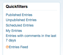
Quick Filters are the links that appear in the right hand column of any and all listing screens. These filters provide users with the convenient means of constraining the list on the page by virtually any criteria. When you register a quick filter, you register a name and a handler for it. The handler is responsible for modifying the query terms and arguments that control how the query that generates the list of objects is constrained and sorted.
Sample config.yaml File
 1 name: Example Plugin for Movable Type
 2 id: Example
 3 description: This plugin is an example plugin for Movable Type.
 4 version: 1.0
 5 applications:
 6     list_filters:
 7         entry:
 8             myfilter1:
 9                 label: "My Filter"
10                 order: 1
11                 handler: $Example::Example::Plugin::myfilter1
On line 7 you see the phrase “entry” which refers to the listing screen you wish to target. A list of listing screens or tables you can target list actions for has been provided below.
On line 8 you see the unique ID or key the developer has assigned to the quick filter. It is not used directly by Movable Type.
List Filter Properties
- label - the display name of the filter
- order - the sort order of the filter when other filters are present on the page
- handler - a subroutine which takes as input a hash reference to the list of filter terms, and a hash reference to a list of args used in rendering the current page
Lists You Can Target
asset- Manage Assets screencomment- Manage Comments screenentry- Manage Entries and Manage Pages screenping- Manage TrackBacks screentemplate- List Templates screentag- Manage Tags screenthesys_user- Manage Users screen (system wide)user- Manage Users screen (blog specific)
List Filter Handlers
Now that you have registered your list filter, you need to implement the handler that is responsible for making modifications to the terms and arguments used in the query that generates the listing screen in question. Let’s take a look at the following very basic handler, and then discuss what it is doing:
sub my_filter {
    my ( $terms, $args ) = @_;
    $terms->{status} = 2;
}
Each list filter, like the one in the sample above, is passed two parameters:
A hash reference to the list of terms that will be used to filter the list of objects currently being viewed.
A hash reference of the arguments used in viewing the contents of the current page. These arguments can control how the list is sorted and in what direction (ascending and descending order for example).
Within a filter handler, developers can modify the contents of the query terms and search arguments passed to them. Let’s look at a concrete example. Suppose we wanted to create a list filter for entries that only displayed those entries with a status of published, and a title of “Movable Type.” In our filter handler, we then set those two properties accordingly:
sub my_filter {
    my ( $terms, $args ) = @_;
    $terms->{status} = 2;
    $terms->{title} = "Movable Type";
}
The terms you can filter by correspond to the property names of the object being filtered. Consult the documentation for the specific object you are filtering by for a complete list of properties and their names.
Adding a Custom Status Message to a Screen
There are numerous instances in which a plugin needs to return a user to a pre-existing screen in the app and display some kind of status message to the user indicating that yes, indeed, what they just clicked on actually did something and it worked (or failed, depending).
Adding a status message requires a developer to use a transformer callback to inject some Movable Type template code into a page. Transformer plugins are covered in great detail in the “Altering the UI” section of this guide, but for now we will show a quick example for this specific use case, as this will come in handy whenever working with list actions and/or page actions.
First, you need to register your transformer callback in your config.yaml like so:
name: Example Plugin for Movable Type
id: Example
description: This plugin is an example plugin for Movable Type.
version: 1.0
callbacks:
    MT::App::CMS::template_source.edit_entry: $Example::Example::Plugin::xfrm_edit
Then, in your Plugin.pm file you will need to add the following subroutine:
sub xfrm_edit {
    my ($cb, $app, $tmpl) = @_;
    my $slug = <<END_TMPL;
    <mt:if name="object_saved">
    <mtapp:statusmsg
        id="super-page"
        class="alert">
        <__trans phrase="The object has been saved.">
    </mtapp:statusmsg>
    </mt:if>
END_TMPL
    $$tmpl =~ s{(<div id="msg-block">)}{$1$slug}msg;
}
Finally, we need a way to trigger the <mt:if name="object_saved"> to evaluate to true. To do this we rely on the fact that the value of any query string parameter is accessible via the corresponding template. Therefore, if we can add “object_saved=1” to the query string of the Edit Entry screen, then the status message we have inserted will appear. To do that there are a number of techniques we can use in any handler you implement. They are:
$app->add_return_arg()
$app->add_return_arg( object_saved => 1 );
return $app->call_return;
$app->redirect()
return $app->redirect('?__mode=foo&object_saved=1');
$app->param()
$app->param('object_saved',1);
return $app->mode('foo');
Dashboard Widgets
Movable Type’s Dashboard is designed to give administrators and users of Movable Type an overview of activity happening within the system or on a single blog. Movable Type ships with a number of dashboard widgets by default, including the following:
- This is You - a mini-stats about your authoring stats
- Tag Cloud - a list of frequently used tags
- MT News - a summary of the latest Movable Type news
- Shortcuts - a list of handy links users commonly access
Movable Type allows developers to define their own Dashboard Widgets using Movable Type’s templating language. These widgets can then be registered with the system to allow users to add them to their dashboard with a click of a button. Here are some samples widgets from some of Movable Type’s more popular plugins:
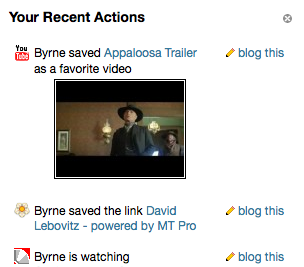
Action Stream Dashboard Widget
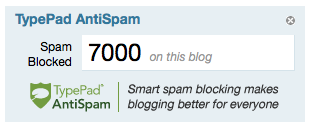
TypePad AntiSpam Widget
Registering a Widget
To register a widget consult the following sample config.yaml:
name: Example Plugin for Movable Type
id: Example
description: This plugin is an example plugin for Movable Type.
version: 1.0
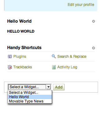
widgets:
hello_world:
label: Hello World
plugin: $Example
template: hello_world.mtml
Then in tmpl/hello_world.mtml you place the following code:
<mtapp:widget class="widget hw-widget"
    label="Hello World"
    can_close="1">
    <h1>HELLO WORLD</h1>
</mtapp:widget>
When all is said and done, users should be given the option to add your widget to their dashboard using a simple pull-down menu.
Registry Properties
system_permission and permission - Requires a certain permission or system-wide permission (on the system dashboard) to add and use the widget. For example,
permission => 'post'would require the user to be able to post to the blog to add your widget to that dashboard. Specify more than one permission using commas.condition - Requires a custom handler to approve of the user and dashboard to add and use the widget. Your coderef is passed
($page, $scope)where$pageis"dashboard"and$scopeis either"dashboard:system"or"dashboard:blog:blog_id".singular - Allows only one instance of the widget on a dashboard, if set true. The widget won’t show up in the “Add widget” list if it’s already been selected.
set - Specifies only a certain column of the dashboard can contain the widget. Set it to
mainorsidebarto only allow the widget in one or the other.code or handler - Customizes the widget’s runtime environment however you like. The callback/handler you specify here will be called with parameters
($app, $tmpl, $widget_param)where$tmplis the template you specified withtemplateand$widget_paramis the parameter set against which your template will be built. When your callback is called it will already contain:- The keys and values from the dashboard page so far
- The
paramvalue from your widget config (I don’t fully grok widget config) blog_idif anywidget_block, the part of the dashboard your widget is in (mainorsidebar)widget_id, the key you filed your widget under in the registrywidget_scope, the scope of the dashboard your widget is in (seeconditionabove)widget_singular, what you set in yoursingularoptionmagic_token, your CSRF-proof token for submitting forms
Note that if through your template or code callback you set the html_head or js_include variables, those values will be appended to the dashboard page’s variables of the same name. You can inject stylesheets and behavior that way. No other content is allowed to escape your widget processing.
Listing Screens
Listing screens are very common in Movable Type. A listing screen contains a table with pagination controls, list actions, page actions in the sidebar, and a display options fly out. Some may even go so far as to say that listing screens are one of the most important screens you will build for a plugin, especially if your plugin defines new data types and objects that users are allowed to manage and interact with.
Listing screens, can also be one of the more complex screens you will assemble and build in Movable Type - and mastering all of the components of one of these screens demonstrates an expert-level of understanding of Movable Type and its various components and user interface controls.
As seemingly complex as these screens may appear, building them is still relatively simple in the grand scheme of things because Movable Type is modular enough and abstract enough to do a lot of the heavy lifting for you. You will however, need to be more than just a little familiar with Movable Type’s templating language and with Perl.
Stubbing Out Your Listing Screen
So let’s taking building a listing screen one step at a time. First let’s orient ourselves to the basic structure to a table listing template, and then we will explore each component in detail. Finally we will discuss the mode handler to populate the template with the data it needs to display a tabular listing of data.
Step 1: Register the Mode
As with any screen you want to add to Movable Type, the first step is always to register a new mode in your config.yaml file, for example:
name: Demo Plugin
id: DemoPlugin
applications:
    cms:
        methods:
            listing: $DemoPlugin::DemoPlugin::Plugin::listing
Step 2: Create Your Listing Template
Before we dive right in and show you a listing screen template in its entirety, let’s familiarize ourselves with the basis structure of the template by removing a lot of the nitty-gritty and technical details. The following sample template is therefore a non-functional and useless example, but it will highlight the major components of a listing screen template.
 1 <mt:setvar name="page_title" value="My Listing">
 2 <mt:setvarblock name="html_head" append="1"></mt:setvarblock>
 3 <mt:setvarblock name="system_msg"></mt:setvarblock>
 4 <mt:setvarblock name="related_content"></mt:setvarblock>
 5 <mt:setvarblock name="action_buttons"></mt:setvarblock>
 6 <mt:setvarblock name="html_body_footer">
 7    <mt:include name="include/display_options.tmpl">
 8 </mt:setvarblock>
 9 <mt:include name="include/header.tmpl">
10
11 <div class="listing-filter">
12   <div class="listing-filter-inner inner pkg"></div>
13 </div>
14
15 <mtapp:listing type="entry"
16     default="No events could be found."
17     empty_message="No events could be found.">
18   <mt:ignore>To be filled in later.</mt:ignore>
19 </mtapp:listing>
20
21 <mt:include name="include/footer.tmpl">
Now, let’s walk through the code above so that you can understand the major components of your listing template.
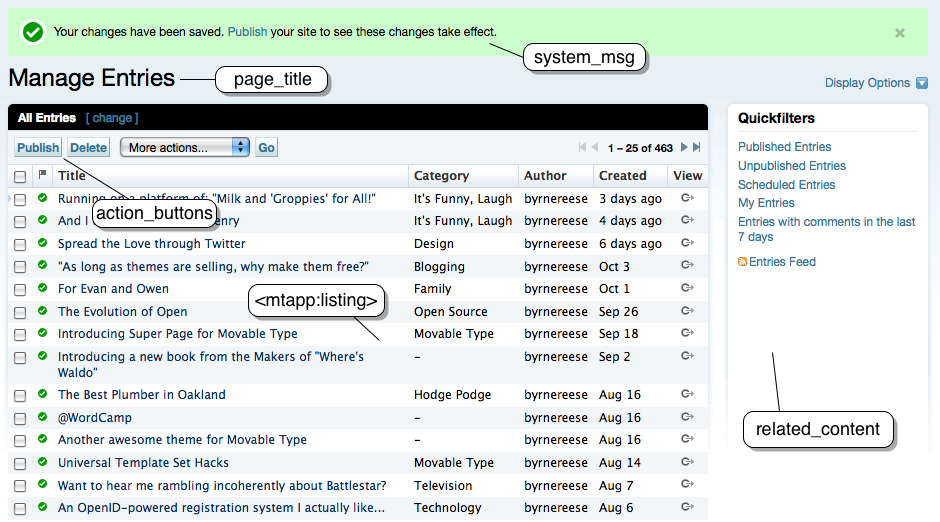
On line 1 we have page_title which displays the title of the page, which appear both as the window title, and as the title heading for the table generated by include/header.tmpl.
Line 2 contains a reference to html_head, which is a variable which gets output within the html > head of the listing screen. This variable allows you to insert your own custom javascript and/or CSS into the page.
Line 3 is system_msg which should contain all of the various status messages that can be displayed to the user from this screen. These status messages are conditionally displayed when a specific condition exists, or when the user has just completed an action.
The related_content variable on line 4, is an optional section found in the side bar of the listing screen. it can contain arbitrary HTML.
The table header contains several components: the list actions pull down menu, the action buttons, and the listing filter. The listing-filter on lines 11-13 can contain any arbitrary HTML, but is typically used within Movable Type to allow users to construct a custom filter for the listing table at hand. On line 5 is where you can find the block called action_buttons that is used to define the buttons that surface with the table itself.
The section defined as html_body_footer is rendered at the very bottom of the screen. This section is used to build out HTML elements and structures that are not shown by default. For example, the “Display Options” fly out dialog is defined in this section, just is only shown when the user clicks the “Display Options” button. This section is not limited to that use case however. It can also be used to display any HTML you want, or to render javascript to the page if you wish.
Finally, there is <mtapp:listing>, a special template tag that automates the generation of much of the HTML associated with the listing table itself, including the pagination controls and basic chrome.
Displaying and Customizing Your Table
The display and generation of the HTML that encapsulates every Movable Type listing is facilitated by the <mtapp:listing> tag. This tag, when populated with the right data (see Implementing a Listing Mode Handler), will create the complex pagination controls for you.
The contents contained by the <mtapp:listing> tag is the table header and table data itself. That is all you need to worry about when displaying a table. Look at this complete example of an <mtapp:listing> tag as a reference for a three column table, with checkboxes for selecting rows.
This code sample below should be inserted into the listing template stub in place of the <mtapp:listing> tag found there.
<mtapp:listing type="entry"
    default="No my objects could be found."
    empty_message="No my objects could be found.">
    <mt:if name="__first__">
      <thead>
        <tr>
          <th class="cb"><input type="checkbox" id="select-all-checkbox"
            name="id-head" value="all" class="select" /></th>
          <th>Column 1</th>
             <th>Column 2</th>
          <th>A Date</th>
        </tr>
      </thead>
      <tbody>
    </mt:if>
    <tr class="<mt:if name="__odd__">odd<mt:else>even</mt:if>">
      <td class="cb">
        <input type="checkbox" name="id"
           value="<mt:var name="id">" class="select" />
      </td>
      <td><mt:var name="column1" remove_html="1"></td>
      <td><mt:var name="column2" remove_html="1"></td>
      <td><mt:var name="date" remove_html="1"></td>
    </tr>
</mtapp:listing>
Enabling Row Selection
If your table uses checkboxes to allow users to select multiple rows in the table, you will need to append the following javascript to the html > head of your page:
<mt:setvarblock name="html_head" append="1">
  <script type="text/javascript"><!--
    var tableSelect;
    function init() {
        tableSelect = new TC.TableSelect("entry-listing-table");
        tableSelect.rowSelect = true;
    }
    TC.attachLoadEvent(init);
  </script>
</mt:setvarblock>
Note: Make sure you change the value of “entry-listing-table” to point to the DOM ID of your table. The value of the DOM ID is generated programmatically and corresponds to the following pattern: <object type>-listing-table.
Status and System Messaging
The system_msg block is reserved for displaying messages to the user regarding the current state of the application or the results from an operation. They are completely optional.
The HTML for a message is generated for you when you use the <mtapp:statusmsg> template tag. The style of the message (success vs error) is set using the class argument on the tag, and the message itself is defined by the contents of the tag. For example:
<mt:setvarblock name="system_msg">
    <mt:if name="saved_deleted">
        <mtapp:statusmsg
            id="saved_deleted"
            class="success">The selected events were deleted.
        </mtapp:statusmsg>
    </mt:if>
</mt:setvarblock>
Classes
To change the style of a message use one of the following classes:
- success
- alert
- info
Displaying a Sidebar
The related_content block is reserved for content for the right sidebar. If no related_content block is defined, then the table will automatically consume the full width of the page.
Application widgets can easily be inserted by using the <mtapp:widget> template tag. But the contents of the sidebar are left entirely up to you.
<mt:setvarblock name="related_content">
    <mtapp:widget
        id="quickfilters"
        label="Quickfilters">
      <mtapp:ListFilters>
      <ul>
        <li><a href="#somewhere">A link!</a></li>
      </ul>
    </mtapp:widget>
    <mtapp:PageActions from="my_list_id">
</mt:setvarblock>
Tip: Don’t forget to include the PageActions template tag so that other developers can dock links and actions to the listing screens you create!
Action Buttons
To insert buttons into the table’s header, you use the action_buttons block. Inside this block you insert links that Movable Type will automatically style as buttons for you. The following example does use a little javascript magic which we will explain in a moment.
<mt:setvarblock name="action_buttons">
  <a href="javascript:void(0)"
     onclick="doForMarkedInThisWindow(
                 getByID('profileevent-listing-form'),
                 'event', 'events', 'id', 'itemset_hide_events');
                 return false;"
     accesskey="h"
     title="Hide selected events (h)">Hide</a>
  <!-- more buttons here if you wish -->
</mt:setvarblock>
The javascript involved here does all of the work for you:
doForMarkedInThisWindow(<table ID>,<singular>,<plural>,
                        <id name>,<mode>);
- table ID - the DOM ID of the table that contains the selected rows
- singular - the singular term for the object being displayed, e.g. “cat” or “dog.”
- plural - the pluralized term for the object being displayed, e.g. “cats” or “dogs.”
- id name - the name of the parameter that will hold the list of selected items in the request that is submitted
- mode - the mode to submit the form to that will process the request
Implementing a Listing Mode Handler
Ok, we are almost done. The last thing that needs to be implemented is the handler that will pull information from the database, and populate your template with the data that will be displayed. The code sample below shows you how to build the simple data structures that will later be used by the $app->listing() subroutine that ultimately outputs all the HTML for you table.
All of these data structures are then passed into the $app->listing subroutine at the very end of the mode handler. This subroutine conveniently interfaces with the database for you. Therefore, you just need to provide $app->listing with the object you are displaying, the terms and arguments it will use when constructing its query to the database, and any other input parameters needed for the template you created above. Movable Type does the rest.
Let’s take a look at a listing mode handler. The code sample below has been augmented with inline comments to instruct you on what each code fragment is responsible for.
package DemoPlugin::Plugin;
use strict;
use MT::Util qw(relative_date);

sub listing_table {
    my $app = shift;
    my %param = @_;

    # This anonymous subroutine will process each row of data returned
    # by the database and map that data into a set of columns that will
    # be displayed in the table itself. The method takes as input:
    #   * the object associated with the current row
    #   * an empty hash for the row that should be populated with content
    #     from the $obj passed to it.
    my $code = sub {
        my ($obj, $row) = @_;
        $row->{'column1'} = $obj->id;
        $row->{'column2'} = $obj->title;
        my $ts = $row->{created_on};
        $row->{date} = relative_date($ts, time);
    };

    # %terms is used in case you want to filter the query that will fetch
    # the items from the database that correspond to the rows of the table
    # being rendered to the screen
    my %terms = (
        author_id => $app->user->id,
    );

    # %args is used in case you want to sort or otherwise modify the
    # query arguments of the table, e.g. the sort order or direction of
    # the query associated with the data being displayed in the table.
    my %args = (
        sort => 'created_on',
        direction => 'descend',
    );

    # %params is an addition hash of input parameters into the template
    # and can be used to hold an arbitrary set of name/value pairs that
    # can be displayed in your template.
    my %params = (
        some_variable => 'You can do ANYTHING in Movable Type',
    );

    # Fetch an instance of the current plugin using the plugin's key.
    # This is done as a convenience only.
    my $plugin = MT->component('DemoPlugin');

    # This is the main work horse of your handler. This subrotine will
    # actually conduct the query to the database for you, populate all
    # that is necessary for the pagination controls and more. The
    # query is filtered and controlled using the %terms and %args
    # parameters, with 'type' corresponding to the database table you
    # will query.
    $app->listing({
        type     => 'entry', # the ID of the object in the registry
        terms    => \%terms,
        args     => \%args,
        listing_screen => 1,
        code     => $code,
        template => $plugin->load_tmpl('my_table.tmpl'),
        params   => \%params,
    });
}
Altering the User Interface
Developers have a couple of different options available to them for modifying the core user interface of the application without modifying the core application itself. These capabilities are added to allow plugins to take the control they need without requiring users to make changes to the application that might make future upgrades more difficult. In this section we will discuss the two primary ways of modifying the core application’s HTML to suit your needs:
Alternate Templates, or “Alt-Templates”
Alt-Templates provide developers with the ability to completely override any template that Movable Type ships with, without hacking the original script in any way. This makes future upgrades less error prone because you don’t need to worry about an upgrade of your core Movable Type system clobbering changes you have made to the core templates. This system works by designating a special directory called alt-tmpl into which can be placed templates you wish to take precedence over their counterparts with the same file name in the tmpl/cms directory.
Transformer Callbacks
Transformer callbacks are a special breed of callback that can be used to dynamically transform the contents of a template before and/or after it has been converted from Movable Type template code into HTML. This system was inspired by an extension to the popular web browser Firefox developed by Aaron Boodman: Greasemonkey. Greasemonkey works on the premise that any page on the web can be [optionally] transformed by a sequence of scripts run against each page. Unlike Greasemonkey which performs these transformations within the browser itself, transformer callbacks are performed by the server, or Movable Type. This means, that these transformations work regardless of what browser your visitors happen to be using at the time.
Alt-Templates
Developers can override the templates used by the application to display its user interface, without overwriting the templates the application ships with, by placing alternative versions of those templates in the /path/to/mt/alt-tmpl directory. Files placed there should have the same file name as the template they wish to override.
For example, let’s suppose we would like to provide an alternative to the Movable Type dashboard. Here are some steps you can follow to make those changes safely without altering the original files:
Make a copy of the dashboard template and place it in the
alt-tmpldirectory:cp /path/to/mt/tmpl/cms/dashboard.tmpl \ /path/to/mt/alt-tmpl/cms/
Edit the file now located at
/path/to/mt/alt-tmpl/cms/dashboard.tmpl
Movable Type will immediately begin using your customized version of the template as opposed to the version that came with Movable Type by default.
Pros and Cons
While alternate templates are by far the simplest and most straight forward way to customize the Movable Type user interface, one major limitation remains: only one plugin can override a template in this manner at a time. Plus, keeping alternate template up to date as the templates they are derived from can be cumbersome and error prone. Therefore, alternate templates are typically best used by users to customize their own installation, as opposed as a mechanism for plugin developers to alter slightly a page’s contents.
Loading Alternate Templates Based upon UserAgent
Every time a page is requested from a Web server, the requesting client transmits information about itself, including the name of the browser making the request, the operating system being used and any additional version information that might be helpful.
The iMT plugin which provides a specially designed user interface for users of Apple’s iPhone makes use of this information to modify the search path for templates in real time based upon the name of the client making the request to Movable Type.
Using init_request to change your alt-tmpl search path
Movable Type plugins can register an init_request callback that is invoked during the initialization phase of the application. This allows plugins to intercept any request to the application for special handling.
In this case, the init_request callback is used to detect if the device accessing Movable Type is an iPhone, and if so, to prepend to the template search path the location of the plugin’s alt templates.
First, register your callback:
name: Example Plugin for Movable Type
id: Example
description: This plugin is an example plugin for Movable Type.
version: 1.0
callbacks:
    init_request: $Example::Example::Plugin::init_request
Then you need the callback handler itself.
sub init_request {
    my $plugin = shift;
    my ($app) = @_;
    $enabled = 0;
    if ($app->isa('MT::App::CMS')) {
        if (my $ua = $ENV{HTTP_USER_AGENT}) {
            if (( $ua =~ m!AppleWebKit/! ) && ( $ua =~ m!Mobile/! )) {
                $enabled = 1;
                # Redirect 'dashboard' or 'default' modes to iphone_main
                $app->mode('iphone_main')
                    if ($app->mode eq 'default') || ($app->mode eq 'dashboard');
                $app->config('AltTemplatePath', $plugin->path . '/tmpl');
            }
        }
    }
}
Transformation Callbacks
Transformation callbacks offer one of the most powerful ways to modify and customize the Movable Type user interface. These callbacks allow developers to intercept any page or template at a specific phase during the rendering process and to modify it in some way. To better understand when these callbacks are invoked, it may help to understand at a high level the process Movable Type goes through in converting a template into HTML that is displayed in the browser. Here is the basic sequence of events:
Movable Type loads the template from the file system.
Movable Type compiles the template’s source code into a machine readable equivalent.
Movable Type loads the data provided by the backend that will later be used as input into the compiled template.
Movable Type renders the template by inputting the data from step 3 into the compiled template from step 2.
Movable Type returns the HTML returned by the system in step 4 to be displayed in the visitor’s browser.
Three main callbacks are invoked at specific points in the process outlined above to give developers a variety of ways and mechanisms by which they can influence, customize and modify the HTML returned by Movable Type to the user’s browser. These callbacks are:
MT::App::CMS::template_sourceis invoked between steps 1 and 2 and allows developers to modify the raw template source code prior to it being compiled into a machine readable form. With this callback, transformations are achieved using basic string manipulation functions like regular expressions.MT::App::CMS::template_paramis invoked between steps 3 and 4 and allows developers to modify the input parameters to the template. It is fired just prior to processing a template. At this point, developers can no longer modify the raw source of the template, but they can however, modify the compiled version by traversing the template’s DOM using an interface very similar to javascript.MT::App::CMS::template_outputis the last callback invoked and is called just prior to step 5. It allows developers to inject content into the final HTML just before it is sent to the browser.
Targeting a Callback to a Specific Template
In order for any of these callbacks to work, you need to know the filename of the template you wish to transform. The file name of the template you are targeting for your transformation is then appended to the end of the name of the callback you are attaching your handler to.
For example, let’s say you wanted to transform the template used to create the Edit Entry screen in Movable Type. A little sleuthing (or a good guess) reveals that the template you want to transform is located at the following path:
/path/to/mt/tmpl/cms/edit_entry.tmpl
To target this template, use just the file’s name, sans extension (e.g. edit_entry) in your config.yaml like so:
name: Example Plugin for Movable Type
id: Example
description: This plugin is an example plugin for Movable Type.
version: 1.0
callbacks:
    MT::App::CMS::template_param.edit_entry: $Example::Example::Plugin::xfrm
Note: You can also target templates provided by your own plugin, or another plugin on the system. It does however require that the filename of the template being targeted end in .tmpl. Any template ending in another extension cannot be targeted by Movable Type’s transformation callback system.
Handling Includes
Movable Type templates have the ability to include other templates. The process outlined above for rendering templates is followed and the corresponding callbacks are invoked whenever an include is processed while the template is being rendered. In other words, template includes are processed on demand as they are encountered, as opposed to be handled up front before templates are even compiled.
Therefore, it is important to know whether or not the template code you wish to influence in some way with a transformation callback is found in an include or the base template itself. This may take some detective work on your part as you trace a template, following various includes while looking for the precise area you want to transform.
Transforming the Template’s Source
In the initial phases of rendering a template, Movable Type loads the template’s source code and then invokes the MT::App::CMS::template_source callback to give plugins an opportunity to transform its contents. At this point, developers have the opportunity to modify the template source using any form of string manipulation available to them. The most common technique being the use of a regular expression.
First, let’s look at the input parameters passed to the template_source callback, then we will follow up with sample code.
Input Parameters for MT::App::CMS::template_source
- $cb - a reference to the current
MT::Callbackobject handling this event. - $app - a reference to the
MT::App::CMSobject processing this request. - $src - a reference to the actual template source
Sample Code
Movable Type passes into the callback as input a reference to the actual template source code. This reference allows the developer to make any modifications to the source code that they wish by modifying the variable itself. This also means that you must utilize a relatively obscure syntax in order to “de-reference” the source code being referred to by one of the callback’s input parameters. For example, look at the following code sample and note the double dollar-sign ($$tmpl) associated with the variable holding the template’s source code:
sub my_xfrm_callback {
    my ($cb, $app, $src) = @_;
    my $slug = <<END_TMPL;
A whole bunch of HTML here
END_TMPL
    $$tmpl =~ s/(<li><mt:__trans phrase=\"Utilities\">\n<ul class=\"sub\">)/$1$slug/;
}
Multiple transformations can be performed by a single callback for any given template.
Using a Template Parameter Transformation Callback
Template Parameter callbacks are invoked after a template has been “compiled,” or in layman’s terms, after the template has been initially processed by the system, but prior to it being rendered into HTML. At this point, one can no longer access the template’s source code directly. You can however traverse the template’s DOM using an API virtually analogous to Java Script’s DOM traversal and manipulation interfaces.
A template parameter callback also gives developers the opportunity to inspect and modify the data that will be used to seed the template with the information that will ultimately be rendered to the screen as HTML.
Let’s first look at the parameters passed to a callback of this type, and then follow up with some example code.
Input Parameters
- $cb - a reference to the current
MT::Callbackobject handling this event. - $app - a reference to the
MT::App::CMSobject processing this request. - $param - a reference to the parameter hash that is populated with the data that will be used in rendering the current template
- $tmpl - the actual
MT::Templateobject representing the current page
Sample Code
sub xfrm {
    my $plugin = shift;
    my ($cb, $app, $param, $tmpl) = @_;
    # do something
}
See Also
- Manipulating the MT::Template DOM
Using a Template Output Transformation Callback
The final callback that is invoked for any given template is the template_output callback which can be used to modify the final output or HTML a template produces. The callback also makes available through its input parameters other data that can be used by the business logic of your callback.
Input Parameters
- $cb - a reference to the current
MT::Callbackobject handling this event. - $app - a reference to the
MT::App::CMSobject processing this request. - $out - a reference to the final output from the template.
- $param - This is the form parameters submitted or passed to the current screen being rendered or modified
- $tmpl - the actual MT::Template object representing the current page
The $param and $tmpl input parameters are made available to provide important context for your callback. However, because the template has already been compiled and rendered into HTML, modifying these input parameters will have no bearing on the final output of your template.
Sample Code
sub xfrm {
    my $plugin = shift;
    my ($cb, $app, $out, $param, $tmpl) = @_;
    $$out =~ /cat/dog/mgi;
}
Traversing and Manipulating the MT::Template DOM
When Movable Type goes through the process of rendering a template into HTML, one of the first things it does it to “compile” the template into a machine readable form, which for Movable Type is a DOM, or “Document Object Model.” In this form, the contents of the template are broken down into a discrete set of “nodes” on a tree. Each node on the tree can be identified by an ID, their class name, and/or their position within the tree.
Once a template has been compiled into its DOM-based counterpart, one can navigate and traverse the tree through a relatively simple and well established set of methods. These methods, or functions, allow you to find the node of the tree, a template tag for example, and modify its properties, and in so doing alter the output of the template.
The following section discusses these methods and techniques you can use within the context of a template_param callback to customize the appearance of a page within the Movable Type application.
Finding and Accessing a DOM Node
There are several methods available to help you obtain a pointer to someplace in the DOM tree. They are:
$tmpl->getElementByID('id')- this method returns the node (template tag) that matches the given ID. The ID corresponds to the same ID you would use to access the same element within javascript, or the ‘id’ attribute associated with the HTML element being modified.my $basename_setting = $tmpl->getElementById('basename');$tmpl->getElementsByTagName('include')- this method searches the template for all tags that match the given tag name (you must not include the namespace part of the template tag - i.e.MT, ormt:). Note: This tag will return an array of tags that match (as there could potentially be many of the same template tag on a page). The following code sample will return a list of all the<mt:include>tags.my @includes = $tmpl->getElementsByTagName('include');$tmpl->getElementsByClassName('msg')- this method returns an array of template tags whoseclassattribute matches the value passed, in this caseclass="msg"$tmpl->getElementsByName('submit')- and, shockingly, this method returns an array of template tags whosenameattribute matches the value passed (name="submit"in this case).
How Movable Type Parses the DOM
The DOM can roughly be described a tree. To help understand how to navigate a tree, it might be helpful to visualize in your mind something you are more intimately familiar with: your family tree. So picture in your mind your family tree.
Now if I were to point to a random person in that tree and ask you to tell me who that person’s parents were, or who their children were, or who their ancestors were, I doubt you would have a challenge doing so. Luckily the concept of a tree and a DOM in programming mirrors these concepts and the terminology used in a family tree that we take for granted almost perfectly.
Ok, so how is this concept translated for use within Movable Type? Let’s take some sample template code, and then see how Movable Type sees it in a compiled form. First, the template code:
<mt:loop id="my_loop" name="object_loop">
    <mtapp:setting
         id="$id"
         label="Name">
      <input id="my_input" type="text" name="name"
         value="<mt:var name="name" escape="html">" id="name" />
    </mtapp:setting>
    <mt:setvarblock name="status_msg_id" id="set_msg">status_msg_<mt:var name="id"></mt:setvarblock>
    <mtapp:statusmsg
        id="$status_msg_id"
        class="success">
      This was created on <mt:var name="created_on">
    </mt:appstatusmsg>
</mt:loop>
Now, let’s take a look at the tree that is built out from the sample code above:
- mt:loop, attributes: id=’my_loop’, name=’object_loop’
- <text node>, value: white space
- mtapp:setting, attributes: id=’$id’, label=’Name’
- <text node>, value: ‘<input id=”my_input” … />’
- <text node>, value: white space
- mt:setvarblock, attributes: id=’set_msg’, name=’status_msg_id’
- <text node>, value: ‘status_msg_’
- mt:var, attributes: name=’id’
- <text node>, value: white space
- mtapp:statusmsg, attributes: id=’$statusmsgid’, class=’success’
- <text node>, value: white space
- mt:var, attributes: name=’created_on’
- <text node>, value: white space
There are a couple things you may notice right away that reflect upon how Movable Type interprets the text and tags it encounters within a template:
The nodes of a template’s DOM consist of two types of elements: a text node and a tag node.
All HTML that is embedded within your template code is considered to be “text,” even if that HTML has within it properly formatted HTML ids and class names.
When traversing the DOM, only Movable Type template tags can be searched for my name, id, or class name. Text nodes are a type of dark matter that is completely opaque to the methods used to search and traverse the DOM.
All white space found in a template (spaces, new lines, etc) is interpreted and preserved by Movable Type as text nodes.
Now that we understand how Movable Type converts template source code into a DOM representation of that code, let’s explore how you as a developer can traverse and find elements within the DOM so that you can edit or modify it.
Traversing the DOM
Whenever you wish to modify the DOM, your first task is always to obtain the node you wish to modify. Once you obtain a reference to the node you can:
- change the node’s properties.
- insert a node as a sibling or child to the current node.
By far the easiest and quickest way to obtain a reference to a node is to refer to it by it’s ID, like so:
my $setvar = $tmpl->getElementById('set_msg');
Furthermore, once you obtain a reference to a node, you can navigate to adjacent nodes by using any of the following methods:
# This would yield the mt:loop element
my $loop = $setvar->parentNode;

# This would yield an array of all the nodes within the loop
my $children = $loop->childNodes;

# This would give me the mt:statusmsg element
my $status = $setvar->nextSibling->nextSibling;
Of course these are just a small sampling of the various methods you can use to traverse up, down and across the DOM tree. Additional DOM API methods exist in accordance with the conventions of Javascript’s DOM APIs.
Now, once you have access to the node you want to make changes to, here are a couple of things you can do to modify them to achieve your desired results:
Getting/Changing a Node’s Attributes
The aptly named getAttribute() and setAttribute() methods allow you to manipulate a node’s attributes. For example, suppose you wanted to hide an element on the page. You can do this using the special hidden class. The following code does this by extracting the current value of the class attribute and appending to it the class “hidden.”
my $node = $tmpl->getElementById('title');

# We first get the attribute instead of setting it directly in case
#    a value already exists so we just prepend hidden
my $class_attr = $node->getAttribute('class');
$class_attr = 'hidden ' . $class_attr;

$node->setAttribute('class', $class_attr);
Creating a DOM Node
Sometimes it is not sufficient to modify an existing node. Sometimes you need to create an entirely new node and insert it into the DOM. Two convenient methods make creating your node relatively simple. The first is the aptly named createElement. One can call createElement by passing it the name of the tag you wish to create along with a list of its attributes. To illustrate, suppose you wished to create this element:
<mtapp:setting id="foo_bar" required="1"></mtapp:setting>
Then your code would look like this:
my $setting = $tmpl->createElement('app:setting', {
    id => 'foo_bar', required => 1
});
As an alternative to building out a DOM tree attribute-by-attribute, one can simply set the element’s innerHTML via the method of the same name. However, this technique is only applicable to block tags.
my $innerHTML = '<input type="text" name="foo_bar" \
     value="<mt:var name="foo_bar" escape="html">" id="foo_bar" />';
$setting->innerHTML($innerHTML);
This perl code is therefore equivalent to the following template code:
<mtapp:setting id="foo_bar" required="1">
  <input type="text" name="foo_bar"
      value="<mt:var name="foo_bar" escape="html">" id="foo_bar" />
</mtapp:setting>
So we have built out a node using one technique or another. Now, in our final step we need to insert it into the DOM. This is accomplished using one of two methods: insertBefore() or insertAfter(). For both of these methods one must pass two arguments: the element/node to be inserted, and the node from which to insert the new node. For example:
# Get our marker
my $basename_field = $tmpl->getElementById('basename');

# Create our element
my $setting = $tmpl->createElement('app:setting', {
    id => 'foo_bar', required => 1
});
my $innerHTML = '<input type="text" name="foo_bar"
       value="<mt:var name="foo_bar" escape="html">" id="foo_bar" />';
$setting->innerHTML($innerHTML);

# Attach our element in the DOM before basename
$tmpl->insertBefore($setting, $basename_field);
This code would yield template code equivalent to the following:
<mtapp:setting id="foo_bar" required="1">
    <input type="text" name="foo_bar"
       value="<mt:var name="foo_bar" escape="html">" id="foo_bar" />
</mtapp:setting>
<mtapp:setting
   id="basename"
   label="$basename_label"
   help_page="entries"
   help_section="basename">
       <input type="hidden" name="basename_manual" id="basename_manual"
          value="0" />
       <input type="hidden" name="basename_old" id="basename_old"
          value="<$mt:var name="basename_old" escape="html"$>" />
...
Forward Compatibility of Alt Templates and Transformer Callbacks
One important consideration to make when choosing to use either alt templates or transformer callbacks is that they may not be forward compatible with future versions of Movable Type. As Movable Type’s user interface evolves, its HTML and DOM tree made change from release to release to accommodate new features. When this happens it is possible for your callbacks to break, or your alt templates to the user interface a broken look.
This is one of the few instances which requires plugin developers to b vigilant in keeping their plugins up to date with the latest version of Movable Type.
Tip: Use version specific callbacks
To counter this affect and to make sure your plugin works with as many previous versions of Movable Type consider using the following trick that leverages the fact that Movable Type can tell you what specific version of MT is currently running:
sub my_xfrm_callback {
    my ($cb, $app, $tmpl) = @_;
    my $slug = <<END_TMPL;
A whole bunch of HTML here
END_TMPL
    if (MT->version eq "4.0") {
        $$tmpl =~ s/(<li>Tools\n<ul>)/$1$slug/;
    } else {
        $$tmpl =~ s/(<li>Utilities\n<ul class=\"sub\">)/$1$slug/;
    }
}
Plugin Settings
Often plugins need a way to allow their users to customize and configure their behavior in some way. For example, an Amazon plugin may want collect your Amazon Associates ID to embed within a link it generates. Or perhaps a theme or template set wants to make it easy for users to change the color scheme, or header image. Regardless of what options you need to surface to your users, Movable Type offers a relatively simple system for doing so.
This system works by editing your plugin’s config.yaml and registering a set of plugin settings, and the templates that will be used for rendering the user interface and form for editing those settings.
The following guide will take you through this process, and then show you some alternatives that make this process even easier.
Registering Plugin Settings
Step one is registering each of the individual settings you will need to make available to your users. In this first step we are not defining the UI for these settings, just that the settings exist, their default values, their scope and what names will be used for storing and retrieving the values they hold.
Here is a small excerpt from a plugin that defines a single setting with a look up key of my_setting:
Sample config.yaml
name: Example Plugin for Movable Type
id: Example
description: This plugin is an example plugin for Movable Type.
settings:
  my_setting:
    default: "Byrne"
    scope: blog
Registry Properties
default - the default value for this plugin setting when no value has been explicitly provided by the user.
scope - the scope for which this setting applies. A value of “system” will indicate to Movable Type to store only one value for this setting across the entire installation, whereas a value of “blog” will instruct Movable Type to store a value for this setting for each blog in the system.
Registering a Plugin Settings Template
Once you have declared what settings will be collected, the next thing you need to do is create the UI for editing them. First you will need to register the config template that will be used for the system level or blog level (or both) settings interfaces. There are two registry properties you can use:
system_config_templateblog_config_template
Each of these properties takes a single value as input, the name of the template file used to render your settings. The template file you will create will need to be placed in your plugins tmpl directory.
Here is a sample config.yaml that shows these registry properties in action:
name: Example Plugin for Movable Type
id: Example
description: This plugin is an example plugin for Movable Type.
system\_config\_template: system\_config.tmpl
blog\_config\_template: blog\_config.tmpl
settings:
  my\_setting:
    default: "Byrne"
    scope: blog
Implementing a Settings Template
With your settings template or templates registered, time to actually implement one. Let’s begin by creating a template called blog_config.tmpl and placing it in your plugins tmpl directory.
The first template we will create will expose a single text field with the label “My Setting.” Here is the template code you would use:
<mtapp:setting
  id="my_setting"
  label="My Setting"
  hint="Enter any value you want here."
  show_hint="1">
    <input type="text" name="my_setting" id="my_setting"
       value="<mt:var name="my_setting">" />
</mtapp:setting>
A couple things to note:
The template above only defines the input elements themselves, the
<form>tag that wraps your input element will be generated for you automatically by Movable Type.Movable Type automatically populates your template with variables that hold the current value of each of your plugin configuration settings. You can use any normal Movable Type template to access these values.
Finally, the single most important detail in making all of this work is utilizing a name for your form elements that are synchronized with the setting you defined for them in your config.yaml. Let’s look at one more example. First your config.yaml:
settings:
  my\_favorite\_color:
    default: "Blue"
    scope: blog
And now the form element that will allow a user to provide a value for this setting:
<mtapp:setting
   id="my_setting"
   label="My Setting"
   hint="Enter any value you want here."
   show_hint="1">
<select name="my\_favorite\_color">
  <option>Red</option>
  <option>Yellow</option>
  <option>Green</option>
  <option>Blue</option>
</select>
</mtapp:setting>
Fetching Plugin Data
By now you should have successfully created a plugin that exposes a simple user interface that makes it possible for you to collect from your users configuration data for your plugin and for that information to be faithfully stored by Movable Type. The following section will instruct you on how to access that information once it has been stored. **Fetching a System-Level Setting** If you need to retrieve the value stored for a setting that is consider a system wide setting, then the following code should do the trick:my $plugin = MT->component("MyPlugin");
my $my_setting = $plugin->get_config_hash('my_setting','system');
Fetching a Blog-Level Setting
Retrieving a blog-specific setting is very similar, and requires only one additional piece of information: the ID of the blog for which this setting applies:
my $plugin = MT->component("MyPlugin");
my $scope = "blog:" . $blog_id;
my $my_setting = $plugin->get_config_value('my_setting',$scope);
And finally, you can fetch all of the values associated with your plugin’s preferences at once by using the get_config_hash method like so:
my $plugin = MT->component("MyPlugin");
my $scope = "blog:" . $blog_id;
my $config = $plugin->get_config_hash($scope);
my $my_setting = $config->{'my_setting'};
Using Configuration Assistant
Even with Movable Type’s capable API for letting developers define their own custom user interfaces for collecting plugin preferences from their user’s, there exists a far easier method by way of a plugin prototype called “Config Assistant.” Config Assistant is useful because it reduces all of the work associated with collecting and accessing plugin configuration data to editing a config file.
To illustrate let’s take a second look at the example explained in gory detail previously that surfaced a single text field called “My Setting.” To accomplish that task you needed to:
- Register the setting in your
config.yaml. - Register a template for rendering your settings form.
- Create a template to display your setting form elements.
That entire process can be reduced to the following config.yaml file:
name: Example Plugin for Movable Type
id: Example
description: This plugin is an example plugin for Movable Type.
settings:
  my_setting:
    default: Byrne
    scope: blog
blog_config_template: '<mt:PluginConfigForm id="Example">'
plugin_config:
    Example:
        fieldset_1:
            my_setting:
                type: text
                label: "My Setting"
                hint: "Enter anything here."
                tag: 'MySetting'
After all that, this is what Config Assistant will output for your plugin’s settings UI:
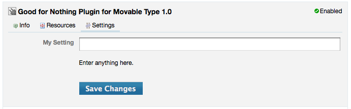
Config Assistant Registry Settings
Config Assistant is driven 100% by configuration data you place in your plugin’s config.yaml. In addition to defining a new data structure for use within your config.yaml, Config Assistant makes use of the following registry keys as well:
settings- you still need to register the values that will be stored in the database.blog_config_templateandsystem_config_template- you also need to provide templates to properly display the form defined by theplugin_configregistry data structure.
The new registry data structure parsed exclusively by Config Assistant is associated with the registry key plugin_config. This element has a single child element, corresponding to the plugin’s id for which you are defining configuration options. It is this element which will contain each of your plugin’s configuration options and input elements, grouped by fieldset. Let’s look at an example that stubs out one possible plugin_config data structure:
plugin_config:
  MyPluginID:
    ServerInfo:
      server_host: *snip*
      server_port: *snip*
    PluginOptions:
      use_https: *snip*
      http_auth_username: *snip*
      http_auth_password: *snip*
The sample above defines two field sets:
- ServerInfo
- PluginOptions
Each of these field sets will be encapsulated by the HTML element from which they get their name:
<fieldset id="ServerInfo">
  <!-- form elements go here -->
</fieldset>
<fieldset id="PluginOptions">
  <!-- form elements go here -->
</fieldset>
Field sets like this provide the benefit of visually grouping related configuration options together. They have no bearing on the functionality of your plugin.
Within each of these field sets, Config Assistant will render their associated form input elements, or “fields.”
Each field then supports the following registry properties:
type - the type of the field. Supported values are: text, textarea, select, checkbox.
label - the label to display to the left of the input element
hint - the hint text to display below the input element
tag - the template tag that will access the value held by the corresponding input element
values - valid only for fields of type “select” - this contains a comma delimitted list of values to present in the pull down menu
rows - valid only for fields of type “textarea” - this corresponds to the number of rows of text displayed for the text area input element
Finally, in order for Config Assistant to properly surface the form under your plugin’s settings area, you will need to define a blog configuration template using the blog_config_template registry property like so:
blog_config_template: '<mt:PluginConfigForm id="MyPluginID">'
Auto-Generated Template Tags
Each plugin configuration field can define a template tag by which a designer or developer can access its value. If a tag name terminates in a question mark then the system will interpret the tag as a block element. Here are two example configs:
feedburner_id:
    type: text
    label: "Feedburner ID"
    hint: "This is the name of your Feedburner feed."
    tag: 'FeedburnerID'
use_feedburner:
    type: checkbox
    label: "Use Feedburner?"
    tag: 'IfFeedburner?'
And here are corresponding template tags that make use of these configuration options:
<mt:IfFeedburner>
  My feedburner id is <mt:FeedburnerID>.
<mt:Else>
  Feedburner is disabled!
</mt:IfFeedburner>
Binding Permissions to Modes and Dialogs
Movable Type makes it easy to control whether a logged in user can see or utilize a given page, action, or menu item. In those cases the Movable Type registry surfaces a permission property which can be set to a list of permissions that the user must have been granted in order to use the corresponding feature. Below is a list of all the permission names/keys Movable Type possesses. Use these when binding permissions within the registry.
System Permissions
- administer
- create_blog
- manage_plugins
- view_log
Blog Level Permissions
- administer_blog
- edit_config
- set_publish_paths
- edit_categories
- edit_tags
- edit_notifications
- view_blog_log
- create_post
- publish_post
- send_notifications
- edit_all_posts
- manage_pages
- rebuild
- edit_templates
- upload
- save_image_defaults
- edit_assets
- comment
- manage_feedback
Cloud Server on August 21, 2012, 2:34 p.m. 返信
Great guide! thanks. The trust/untrust/ban/unban commenter feature is a really nice touch and easy to work with.